

Salus
A platform to make navigating the COVID-19 pandemic easier for our community
UX Design
Duration
10 weeks
Sept 2021 - Dec 2021
Role
Team Lead
UX Researcher
UX Designer
UI Designer
Tools
Figma
Miro
Adobe Photoshop
This project was completed as part of a graduate course in user-centered design at the University of Washington in Autumn 2021.
It is based on the course theme of:
"Back to whatever this is" in reference to the state of the world in the midst of pandemics and chaos.
Design Challenge:
How might we make accessing, compiling, and sharing information about changing pandemic requirements in local spaces and providing documentation more easily accessible while incorporating community and relevant data?
Demo Video
Salus (sah-luss)
1. Latin: “safety,” “salvation,” “welfare”.
2. Roman goddess of safety and well-being (welfare, health, and prosperity) of both the individual and the state.
Key Features


4. Physical accessories
No need to pull out your phone at the door each time! Just show your Code on an accessory to scan in. Physical accessories facilitate a newfound connection or even delight in navigating COVID-19 and serve those who do not often use or rely on technology.
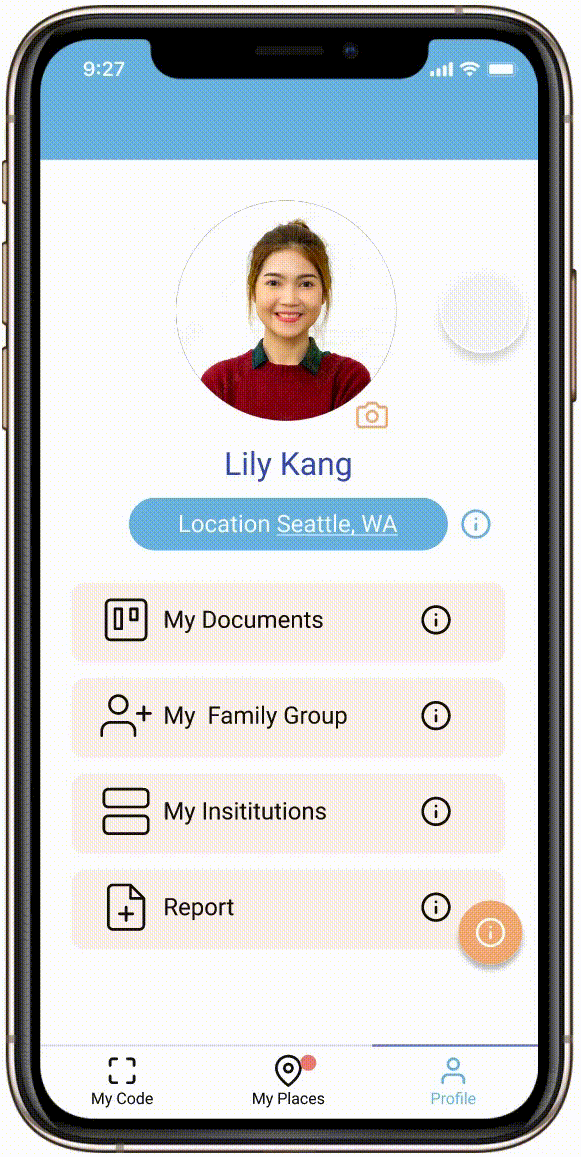
3. Saved Places
Save your favorite places to have easy access to their information and get updates about requirement changes.
1. Customized, scannable Code
Your Code is connected to your verified COVID-19 documentation (e.g. vaccination card, negative test results) and can be scanned for hassle-free access to public spaces. The Code can be customized to fit your personal style.
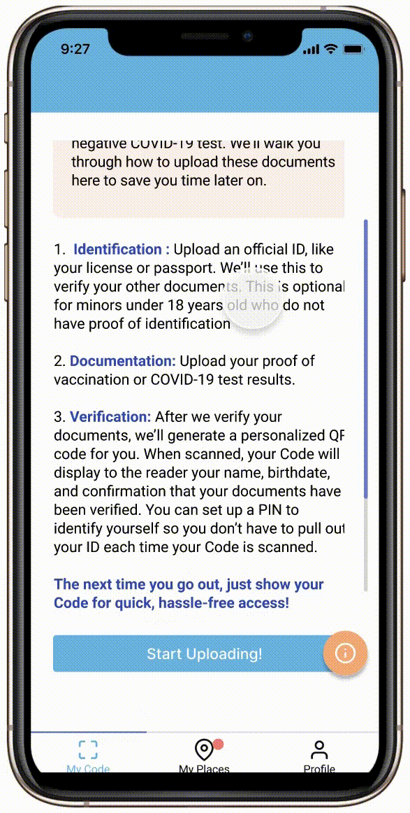
2. Verification via ID
Verify your documents on the platform just like you would at the door, except you only have to do it once.
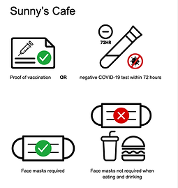
5. Standardized Symbols
Clean, simple, systematic and uniform symbols can be understood quickly and easily and are also accessible to users with varying levels of technology proficiency
Design Process

Research:
By using a combination of methods for exploratory and foundational research, we identified existing pain points, feelings, perceptions, and interactions within and about the current systems, which set the direction for the project


1. Survey
2. Interview
3. Diary Study
4. Competitive Analysis
5. Observation
Survey
Hosted on Qualtrics
39 responses
Main focus:
-
What are the most confusing and/or troublesome parts of navigating changing rules for people who visit these places?
-
How do people learn about the guidelines and requirements for places they visit?
-
How would they want to, ideally?
Goals:
-
Tap people’s perceptions of these systems and allow them to elaborate further than we would be able to glean from observations in real-time.
-
Explore and tease apart what a large number of people themselves think of these systems, positive or negative, rather than just rely on our own thoughts and intuitions.
Competitive Analysis
Competitive analysis of platforms that had similar or parallel features, functionalities, and goals to those we hoped to incorporate into our design.
5 platforms
Goals:
-
Understand existing options for users.
-
Gain insight into what is working and resonates with users, and what pieces may still be missing.
-
Avoid designing a redundant solution.
Interview
Interviews with “information distributors” who are responsible for compiling rules for individuals visiting places they are responsible for managing.
3 participants
Goals:
-
Understand the roles, processes, and thoughts of information distributors so that we can account for all sides of the equation to create a holistic solution that does not leave any factor out.
Diary Study
Study done with primary users; adults who visit public spaces.
6 participants
Format:
1. For three (3) days, fill out 10-minute daily response form regarding daily outings and interactions with COVID-19 requirements (via Google Forms).
2. Exit interview at the end of the three days.
Goals:
-
Understand how individuals find out and navigate COVID-19 rules in the places they visit in their daily lives.
-
Naturalistic approach = raw data about people’s current interactions with these systems.
-
Inform our decisions about how to fit our design into current habits and processes amongst the general public.
Observation
Observing and documenting signs currently used by businesses and institutions to communicate COVID-19 requirements.
Goals:
-
Take stock of current practices in communicating requirements visually


Examples of signs outside businesses and institutions


Insights:
-
There is confusion, frustration, or anxiety when navigating current pandemic requirements.
“People get confused about hours and if places are closed due to covid or not” - Information Distributor
-
There is friction at the entrance of public spaces. The design of the vaccine cards and lack of a widespread convenient digital option contribute to this friction.
(What would you change about the system/process of verifying vaccination status?)
“Centralized vaccination app/website with database for real-time verification easily accessible to the public” - Survey Participant
-
Many individuals do check requirements for exceptional outings, like attending an event. Information is often distributed by email, though it often gets lost in the process and over time.
-
Individuals are sometimes caught off guard by updates to the requirements that they did not know of beforehand.
“If you’re asking how I will know about guidelines, I don’t know where to check. Even if I check on Google or a restaurant website, I have never seen anything on a restaurant website.” - Diary Study Participant
-
Relationships with information and data have changed as the pandemic has progressed. Whereas information sharing has previously been scary and punitive, people are now generally more interested in community-centered and, perhaps, even occasionally delightful information sharing.
-
Varying levels of technology proficiency leave some people out of current solutions, which rely heavily on digital technologies.

Sorting data and extracting insights
Design Requirements:
Synthesizing what we learned from our foundational and exploratory research, we developed a list of design requirements for our solution.
-
The solution should be systematic and uniform, so that information can be understood quickly and easily.
-
The solution should be easily implemented alongside existing information flows and decision-making processes.
-
The solution should be adaptable to the constantly changing landscape of the COVID-19 pandemic.
-
The solution should be easily shareable, as many people find out about changes through word of mouth.
-
The solution should highlight the relationship between requirements and community well-being, as opposed to a punitive approach.
-
The solution should deliver information directly to users.
-
The solution should provide a frictionless experience at the entrance of public spaces.
-
The solution should be accessible to users with varying levels of technology proficiency.
Personas
Personas were generated to more realistically embody our design requirements and speak to a variety of use cases of our solution. By creating and referencing these personas throughout the design process, we are able to ensure that our solution is hitting key points that would matter to stakeholders.


Design & Prototyping:
We went through several rapid iterations of sketching and prototyping, incorporating user research at each step to arrive at our final product.
Sketching
We began our design process by generating a large body of sketches pertaining to our platform, from UI interfaces, to physical products, to systems interactions, in order to document, sort through, and discuss all possible ideas and avenues. We chose a handful of these sketches to further refine for incorporation into our solution.


Examples of initial sketches


Examples of refined sketches
Storyboards & User Flows
After further defining the chosen aspects and features of our solution from our sketches, we developed storyboards and user flows to explore and illustrate the use cases of the main features of our platform. These allowed us to envision and understand how our solution would be utilized in a real-world setting, adding both to our designs concepts and the legitimacy of our platform.


Storyboards


User flow diagrams
Design Language
-
A simple design language without extraneous graphics and embellishment was opted for both to reflect the practical nature of the platform and to not distract or confuse, especially for users who are less familiar with digital technologies.
-
Blue was chosen as the main color because of its prevalence in healthcare settings and associations with credibility, trust, and knowledge along with cleanliness and calm. Oranges and yellows invoke community, warmth, and optimism.


Low-Fidelity Prototype
A low fidelity wireframe and prototype with placeholder text and images was created to plan out the general flow of the main features of our platform. We used this low-fidelity prototype for our first round of usability testing in order to gain feedback about our design so we could make appropriate changes as we move toward our mid and high-fidelity prototypes.

Testing & Iteration:
Formal usability testing using our low-fidelity prototype and informal peer usability testing using our mid-fidelity prototype were administered in order to evaluate our design choices and identify areas of improvement as we worked towards the high-fidelity prototype.
Usability Testing 1 (Lo-fi prototype)
Users were asked to walk through a number of scenarios and tasks explained by the team member while using the low-fidelity prototype.
Participants:
-
7 users (25-67 years)
The age range in our usability testing sample had much greater variety than those used in our exploratory research. This allowed us to gain valuable insights from a demographic that has otherwise not had a voice in our design process.
Tasks tested:
-
Sign up and onboarding
-
Uploading vaccination card
-
Ordering accessories
-
Bringing up your Code
-
Adding new places to your saved places
Major findings and changes:
-
Issue: The definition of a “tag”* is unclear and unfamiliar. Users thought of a “tag” as a physical tag (e.g. clothing tag). The relationship between the digital QR code and physical accessories is unclear. *In the low fidelity prototype, My Code was called My Tag
-
Change: Changed the name of the Tag to Code, which has a clearer connection to the digital qualities of the Code.
-
-
Issue: “Upload Photo” and “Take Photo” are unclear. Users got confused about the type of photo and of what. Users erroneously assumed that they were uploading a photo of themselves or a photo unrelated to the document. Photo is often understood as a photo of a person. Confusion about the two options of “upload” and “take” potentially meaning that you have to do both.
-
Change: Updated wording to indicate the reference to the type of document: “Take photo of [documentation or identification]”, “Upload [documentation or identification] from Photos” to make clear what the user should be uploading.
-
-
Issue: General confusion about terms and definitions (e.g. “My Places”, “My Institutions”, “Report”, “Verification”).
-
Change: Added informational popups, FAQ page, and definitions of terms throughout the platform to address areas of possible uncertainty. Added more explicit instructions after each key process to indicate what the next options are on the platform.
-
See the complete list of changes here
Mid-Fidelity Prototype
Upon completion of our usability testing, we developed a mid-fidelity prototype to implement these changes and fill out more of the content of the platform.

Usability Testing 2 (Mid-fi prototype)
Testing was done in an informal group setting where the team both walked through and explained the platform and asked users to walk through tasks
Participants:
-
6 Human Centered Design graduate students
Tasks tested (same as usability testing 1):
-
Sign up and onboarding
-
Uploading vaccination card
-
Ordering accessories
-
Bringing up your Code
-
Adding new places to your saved places
Major findings and changes:
-
Issue: Consideration for minors and those who do not use phones often
-
Change: Added Family Groups that allow users to create and access codes and information for people who are added to their group.
-
-
Added PIN option when scanning Code for extra security and ID validation
-
Added feature to view where your Code has been scanned
See the complete list of changes here
High-Fidelity Prototype
Our high-fidelity prototype incorporates all changes from testing both low and mid-fidelity prototypes in addition to incorporating our style guide, full content, and complete flow through the main features that we have implemented.

Click to demo!


Frames and flows from high-fidelity prototype
Physical Accessories
The inclusion and development of physical accessories spoke to the need for solutions that were accessible and inclusive to those who do not have regular access to digital technology.
Digital Mockups
We first created digital mockups to visualize what they accessories would look like and to aid with our design.


Mid-fidelity Prototypes
Mid-fidelity physical prototypes of two of the accessories were made so that we could have a tangible representation of what they might look and feel like and evaluate their practicality of use.


Final Notes:
Because of time and resource restrictions due to the nature of this quarter (10 week) -long project, there were several limitations and abbreviations in our process
In Scope
The following areas and main features are within our current scope of implementation and are covered in our documention:
-
Mobile implementation
-
Sign up process
-
Onboarding process
-
Uploading identification
-
Uploading documentation
-
Creating a Code
-
-
Ordering physical accessories
-
Saved places
-
Explore area
-
Physical accessories
Out of Scope
The implementation of the following features are not discussed in our documentation, but are formal parts of this design solution and have been discussed by our team as next steps:
-
Interfaces and flows for these main features:
-
Businesses & institution registration and management
-
Assignable roles (e.g. Admin, manager, member) for institutions
-
Code scanners
-
Reporting test results
-
Code Customization
-
Viewing scanned locations
-
Family groups for families, caregivers, other life helpers
-
Setting a PIN
-
-
Comprehensive symbol/icon glossary and bank
-
Media kit for information distributors
-
Crowd sourced data on characteristics places (e.g. distanced space, open windows)
-
Calendar integration for saved places and updates
-
Integrated data and statistics
-
Photo editing for clarity of uploading document photos
-
Web implementation
The platform is not intended to provide these functionalities:
-
Documentation fraud detection beyond verifying against identification information (name and birthdate), which is the current verification system in place when verifying documentation in person in the United States